Opinions
-
cdybeijing

- Lives in gote
- Posts: 581
- Joined: Fri Apr 30, 2010 2:27 am
- Rank: IGS 2 dan
- GD Posts: 0
- Location: Shanghai, China
- Has thanked: 96 times
- Been thanked: 100 times
- Contact:
-
Laman

- Lives in gote
- Posts: 655
- Joined: Thu May 06, 2010 10:24 pm
- Rank: 1d KGS
- GD Posts: 0
- KGS: Laman
- Location: Czechia
- Has thanked: 29 times
- Been thanked: 41 times
- Contact:
Re: Opinions
sorry for partially repeating previous ideas
i voted for number 2, but neither variant is perfect... 1 looks like Kjaj, 3 like Kial. neither 2 nor 3 have any connection to go, though this may not be necessarily bad, because virtually every go project tries to get black or white stones or something similar to its logo and as a result plenty of them looks all the same
as i feel meaning of the word 'kiai', fighting spirit, the logo should be something light, dynamic, even aggressive - in this aspect number 2 and also 3 gain points for their (under/over)line
when i hear kiai (in connection with go), i imagine player smashing a stone on the board, and with that stone delivering ear-reddening move / dead heart tesuji / whatever (i know this is not exactly the original meaning of the word, it is what it brings to my mind). i could imagine a stone of one color crushing a stone of the other one, accompanying the word.
number 1 looks too steady and static for representing kiai how i feel it
unfortunately i am not skilled enough to come with an actual picture myself, other designs to choose from wouldn't be bad
PS: would you mind telling us what kind of project will Kiai be? i think 2 words - 1 sentence would be enough, no details needed
Spilling gasoline feels good.
I might be wrong, but probably not.
I might be wrong, but probably not.
-
jts

- Oza
- Posts: 2672
- Joined: Sat Sep 18, 2010 4:17 pm
- Rank: kgs 6k
- GD Posts: 0
- Has thanked: 310 times
- Been thanked: 637 times
Re: Opinions
As it stands I like "1" best, but I think that a revised version of "3" could be even better. Suggestion:
(i) Switch the font to Courier
(ii) Switch the color from red to black (red on white looks way too bright and happy to me)
(iii) Making the markings more obviously claw marks.
Also, at the risk of being totally tacky, the radicals for "ki" and "ai" already vaguely resemble their roman equivalents. The rice radical looks like a "k", the right side of the air radical could become an "i", man over one looks like "A"....
-
voice1
- Dies in gote
- Posts: 23
- Joined: Fri Mar 25, 2011 4:48 am
- Rank: kgs 5k
- GD Posts: 0
- KGS: voice1
- Has thanked: 3 times
- Been thanked: 1 time
Re: Opinions
Seeing as the first design is by far and large the most popular, we've done a bit of work on the idea. Now, we want this design to be two things, so keep these in mind if you hate it (but don't hold back critique, please!):
1. Modern--we have no hatred for the old stuff (or we wouldn't play Go, right?) but we want this to be accessible and "new."
2. Youth-oriented--Our projects are designed for youth in general, being our members are all under 21. Also, they are all online projects, so we expect most users will be younger (based solely on the fact that young people use the internet a lot).
With that being said, here's the design. Any comments? Anything you hate? Anything that could be done better? Is the weathering hard to see on your screen?(We are fortunate to have a high quality screen for designing, but we lack empathy for those of you that don't, so please force it on us!)
Slightly larger image for larger screens! http://i54.tinypic.com/2jbs01k.jpg
Communication is two ways. One must speak, then listen. ~Me
-
Loons
- Gosei
- Posts: 1378
- Joined: Tue Apr 20, 2010 4:17 am
- GD Posts: 0
- Location: wHam!lton, Aotearoa
- Has thanked: 253 times
- Been thanked: 105 times
Re: Opinions
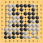
I like the general design and new slightly worn grid look, but it looks like you had the neat kiai/grid and then pasted a picture of a stone on top of it. I don't know how to avoid this look. Maybe it's the quite photorealistic look of the stone.
NB I don't know anything about art.
NB I don't know anything about art.
-
Laman
- Lives in gote
- Posts: 655
- Joined: Thu May 06, 2010 10:24 pm
- Rank: 1d KGS
- GD Posts: 0
- KGS: Laman
- Location: Czechia
- Has thanked: 29 times
- Been thanked: 41 times
- Contact:
Re: Opinions
voice1:
I agree with Loons, the stone looks somewhat weird and as i measured it, i think it should be a bit larger (just copy it and place the 2 next to each other to judge)
by the way, to avoid the 'kjaj' look, what about disconnecting 'i's from the grid? and i liked the original combination with red... something like this, maybe?


(the underline is not very good, but neither are my graphic skills )
)
I agree with Loons, the stone looks somewhat weird and as i measured it, i think it should be a bit larger (just copy it and place the 2 next to each other to judge)
by the way, to avoid the 'kjaj' look, what about disconnecting 'i's from the grid? and i liked the original combination with red... something like this, maybe?
(the underline is not very good, but neither are my graphic skills
Spilling gasoline feels good.
I might be wrong, but probably not.
I might be wrong, but probably not.
-
Mivo
- Lives in gote
- Posts: 335
- Joined: Tue May 11, 2010 2:03 pm
- GD Posts: 351
- Location: Germany
- Has thanked: 41 times
- Been thanked: 97 times
Re: Opinions
I really like Laman's modifications! Especially the version with the red exclamation mark, which not only breaks up the monochrome scheme, but also adds a neat double meaning (in chess very good moves are marked with a "!", and I think I've seen this in some go game records as well). Furthermore, it takes away attention from the stone, which I felt drew too much attention before.
-
voice1
- Dies in gote
- Posts: 23
- Joined: Fri Mar 25, 2011 4:48 am
- Rank: kgs 5k
- GD Posts: 0
- KGS: voice1
- Has thanked: 3 times
- Been thanked: 1 time
Re: Opinions
I like the idea of disconnecting the grid from the "i's" and I think I have a way of doing so that may satisfy your desire for red in it, as well as giving it some some fighting spirit! I'll work do some on it and see if I can't have it posted within a few days. Of course I have to talk to ricky1 about it and see what he thinks.Laman wrote: by the way, to avoid the 'kjaj' look, what about disconnecting 'i's from the grid? and i liked the original combination with red... something like this, maybe?
Communication is two ways. One must speak, then listen. ~Me
Re: Opinions
The problem I think you're referring to is the fact that the stone has an outline. I did realize this when I finished the design, but I was getting tired, and to be honest, lazy. I agree with your point, though, it looks slightly weird.Loons wrote:\it looks like you had the neat kiai/grid and then pasted a picture of a stone on top of it.
I like your second modification. But I think it might work better if we didn't disconnect the "i"s from the grid. Let me do some Photoshopping of your idea and see. (Also, red is a good Kiai color. Glad you liked it!)Laman wrote:by the way, to avoid the 'kjaj' look, what about disconnecting 'i's from the grid? and i liked the original combination with red... something like this, maybe?
-
Chew Terr
- Gosei
- Posts: 2060
- Joined: Mon Apr 19, 2010 12:45 pm
- Rank: KGS 3k
- GD Posts: 264
- KGS: Chew
- Location: Texas
- Has thanked: 546 times
- Been thanked: 172 times
- Contact:
Re: Opinions
Yeah, the red underline might be enough to avoid 'looking like js'.
Someday I want to be strong enough to earn KGS[-].
Re: Opinions
Let's hope you're right, sir! Looked good to me, but then again, I never saw the problem to begin with.Chew Terr wrote:Yeah, the red underline might be enough to avoid 'looking like js'.
Opinions, then? Will this bring out the "Is" the way we want? Again, not a finished product. Also, white or black stone?


Also, who knows the grammatically correct way to refer to the "Is"? Is it "I"s, "Is", "I's", etc.?